Valia Pratas
Nome, Marca e Identidade Visual
__
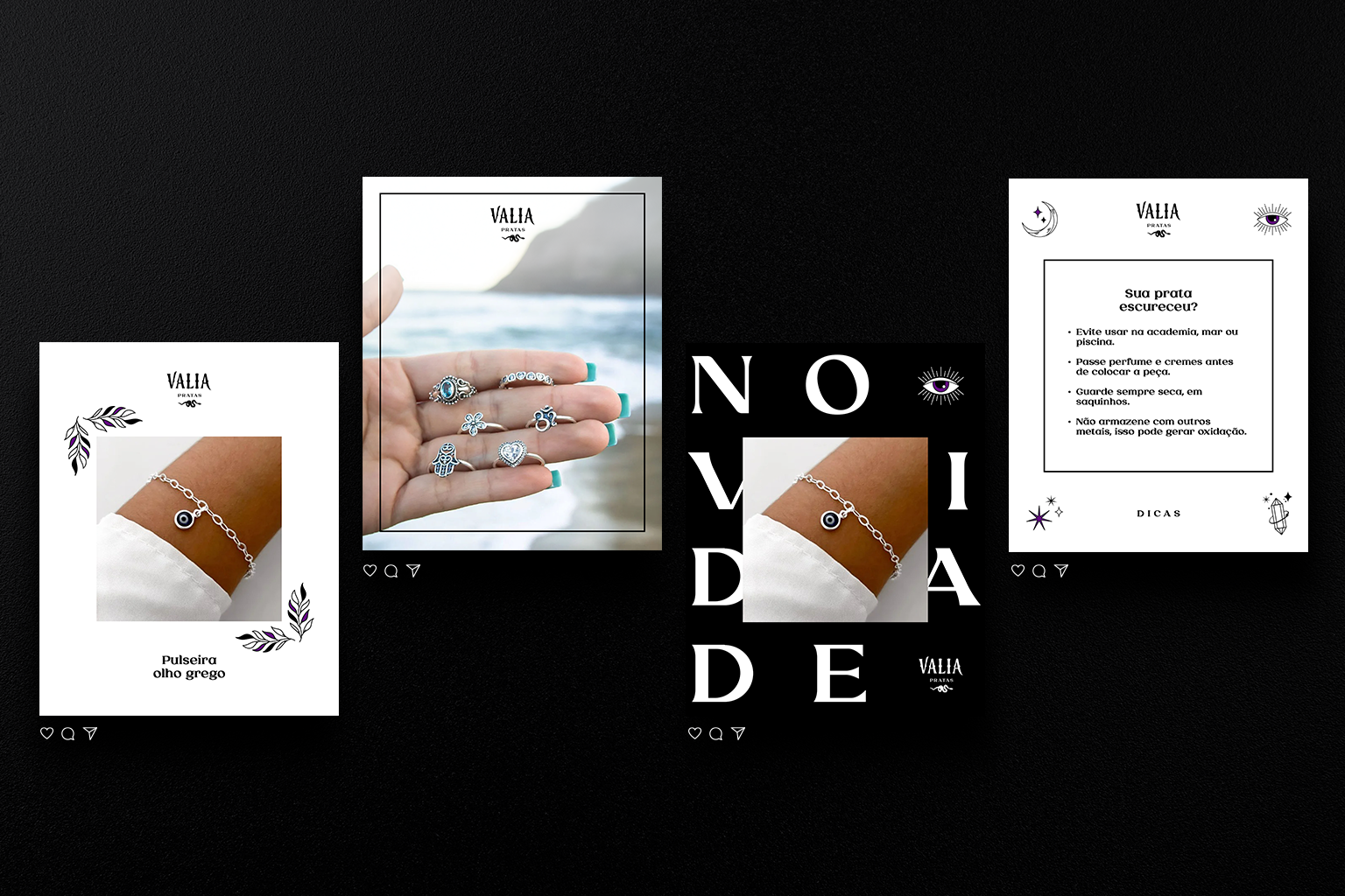
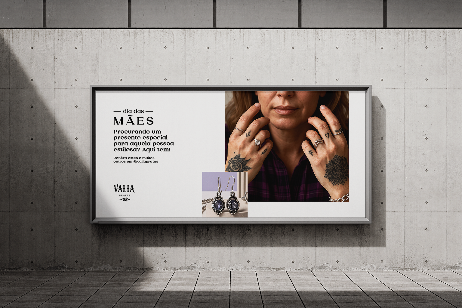
A empresa de joias Valia Pratas nos trouxe um desafio que adoramos, criar um logo diferenciado da concorrência, que fugisse dos clichês do mercado refinado e elegante, e trouxesse um estilo jovem, ousado, de atitude, representando mais a essência da cliente. Nosso trabalho envolveu logo, identidade visual e nome para a marca.
A criação do nome surge para transmitir “algo de valor, valioso e importante”, trazendo simplicidade e objetividade para um nome curto e de fácil memorização e entendimento.
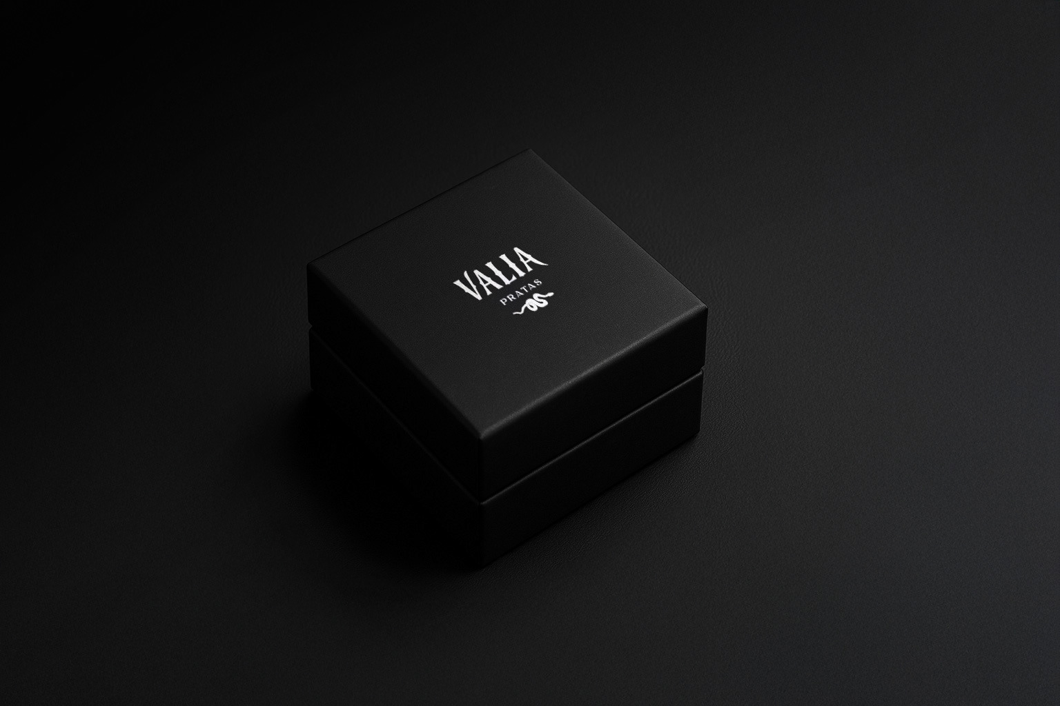
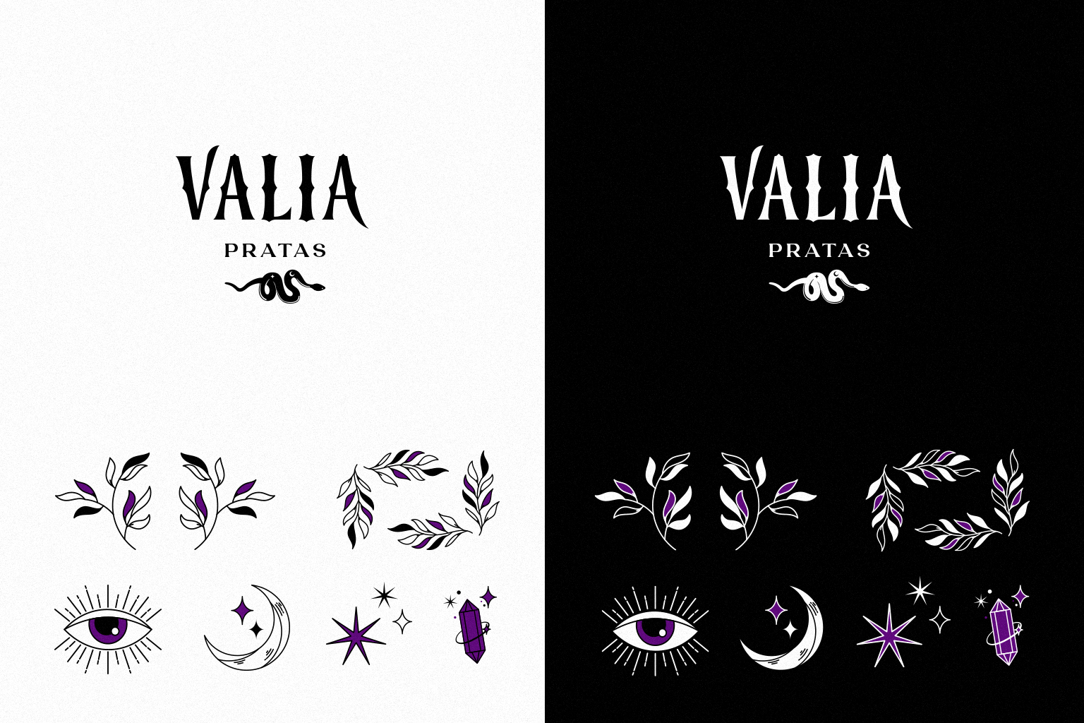
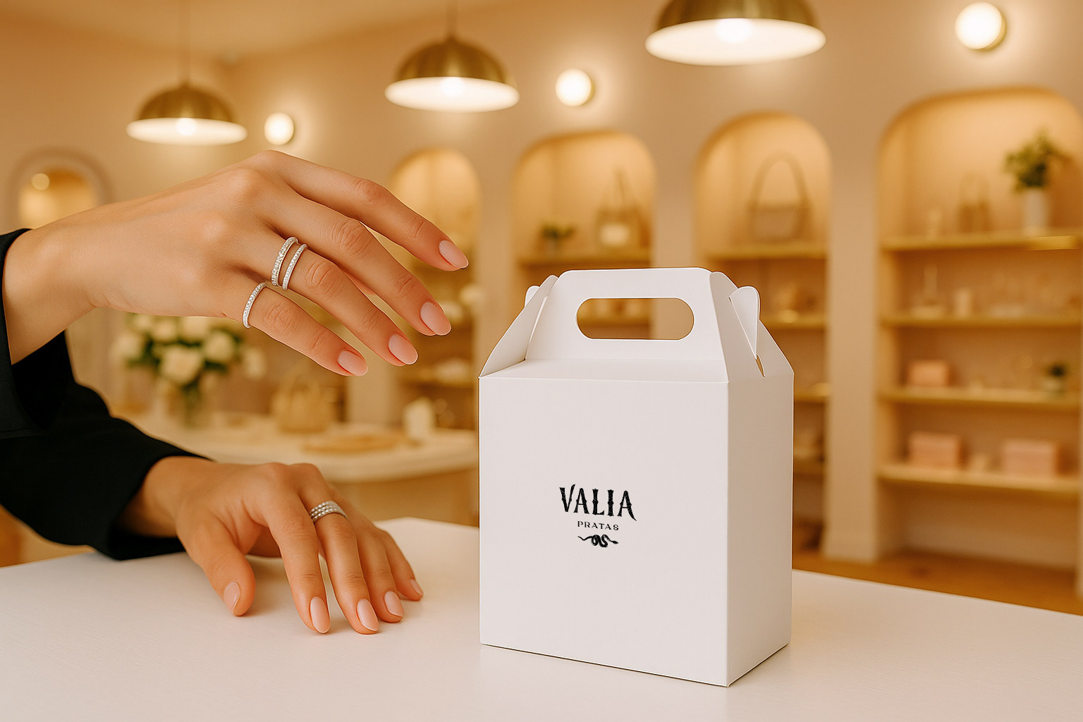
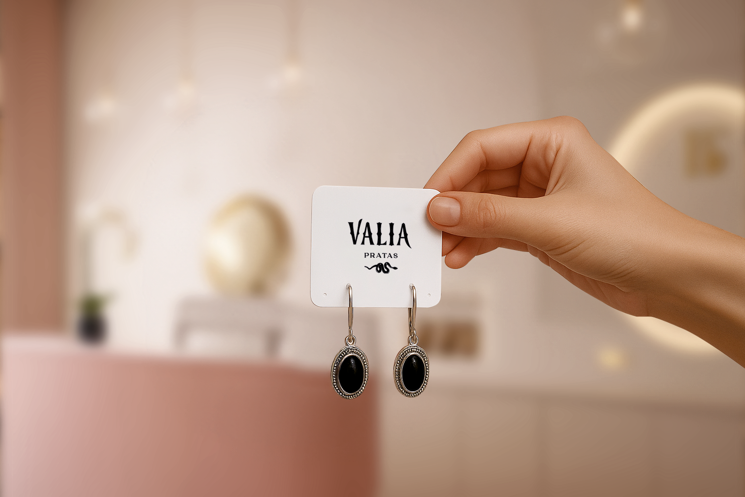
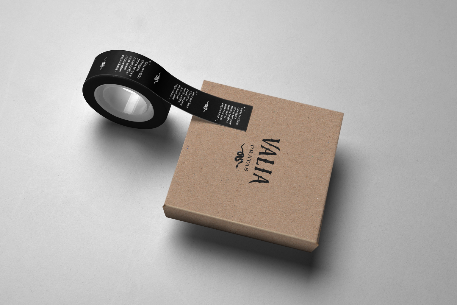
Para o logo, definimos a utilização do símbolo da cobra, remetendo a transformação de estilo que as clientes vão passar após usar as peças diferenciadas da marca. A tipografia é cheia de personalidade e traz um visual mais rock and roll, reforçando os atributos de ousadia e atitude.
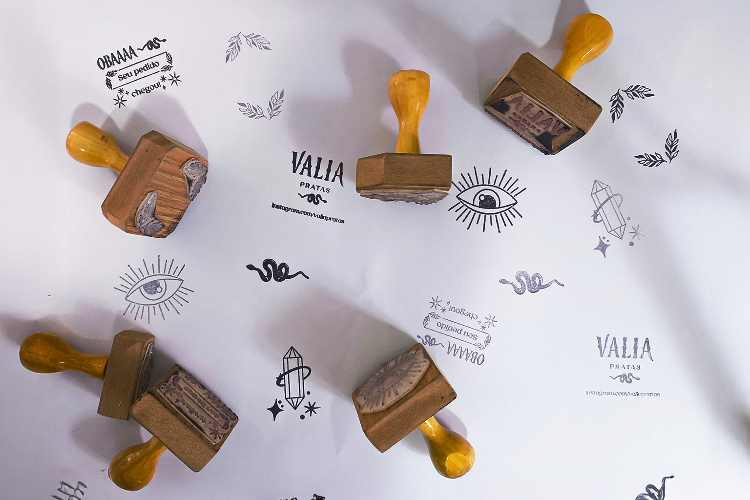
Já a identidade visual traz ilustrações customizadas em contraste com um visual mais limpo e com poucos elementos, deixando o destaque principal para o logo e as fotos das peças.
---
The jewelry company Valia Pratas brought us a challenge that we loved: to create a logo that stood out from the competition, that would break away from the clichés of the refined and elegant market and bring a young, bold, and assertive style, representing the client's essence. Our work involved the logo, visual identity and name for the brand.
The name was created to convey “something valuable, valuable and important”, bringing simplicity and objectivity to a short name that is easy to remember and understand.
For the logo, we decided to use the snake symbol, referring to the transformation style that customers will experience after wearing the brand's distinctive pieces. The typography is full of personality and brings a more rock and roll look, reinforcing the attributes of boldness and attitude.
The visual identity features customized illustrations in contrast with the cleaner look of the pieces, leaving the main focus of the identity to the logo and the photos of the pieces.