Ceuticos
Marca e Identidade Visual
__
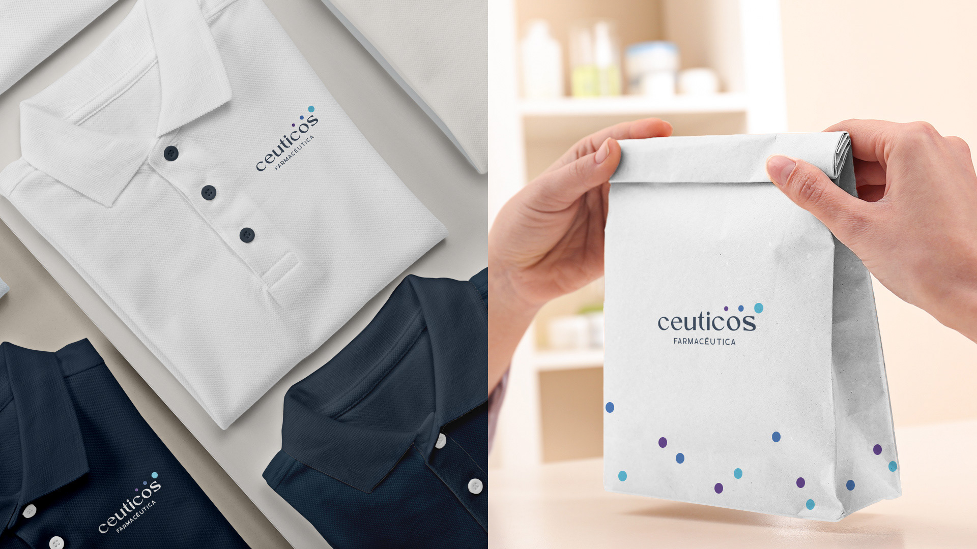
A Ceuticos é um laboratório farmacêutico com foco em suplementos alimentares que auxiliam a saúde e o bem-estar dos clientes. Atuando em diversos segmentos, e em busca de expandir sua atuação regional, a empresa precisava de um rebranding de marca para passar uma imagem mais moderna e profissional.
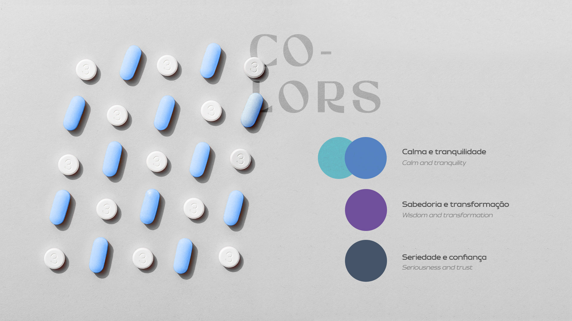
Para manter a empresa alinhada e bem posicionada em seu segmento, definimos os atributos de marca em: saúde, humano, transformação e confiança.
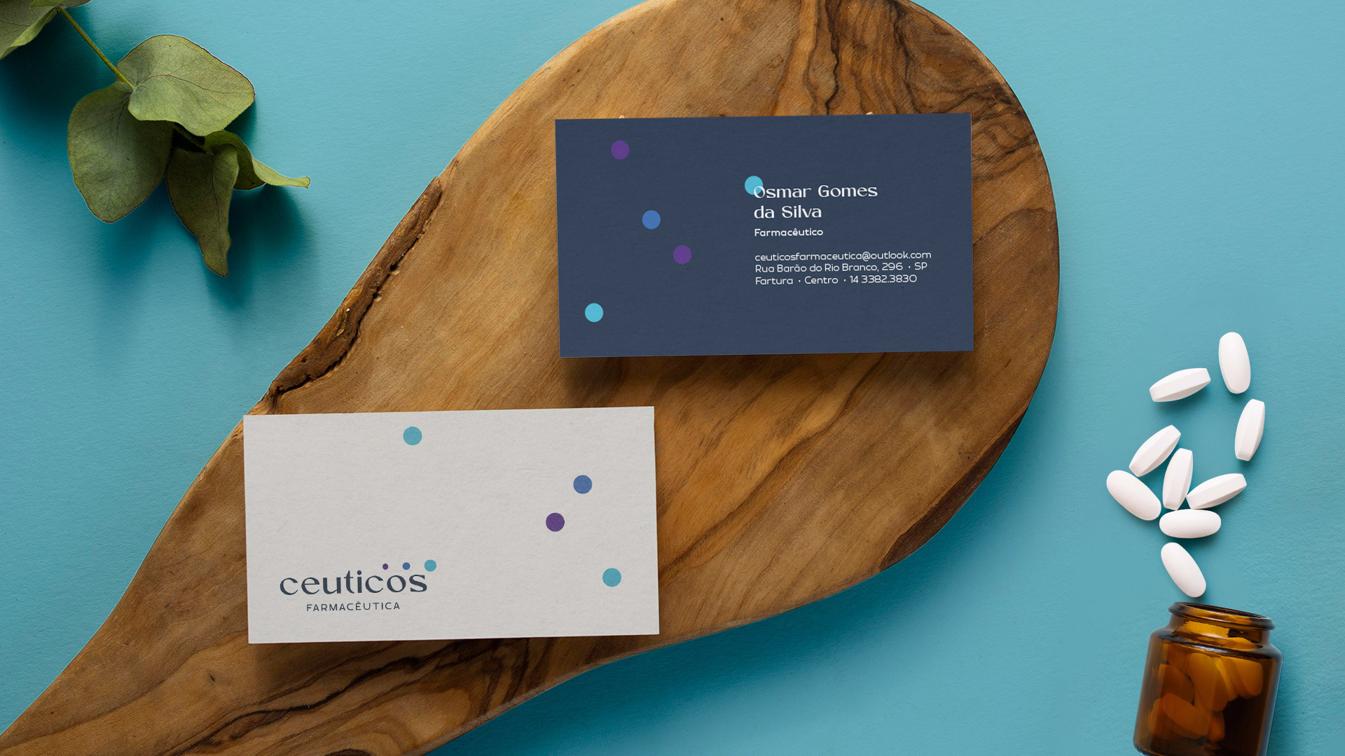
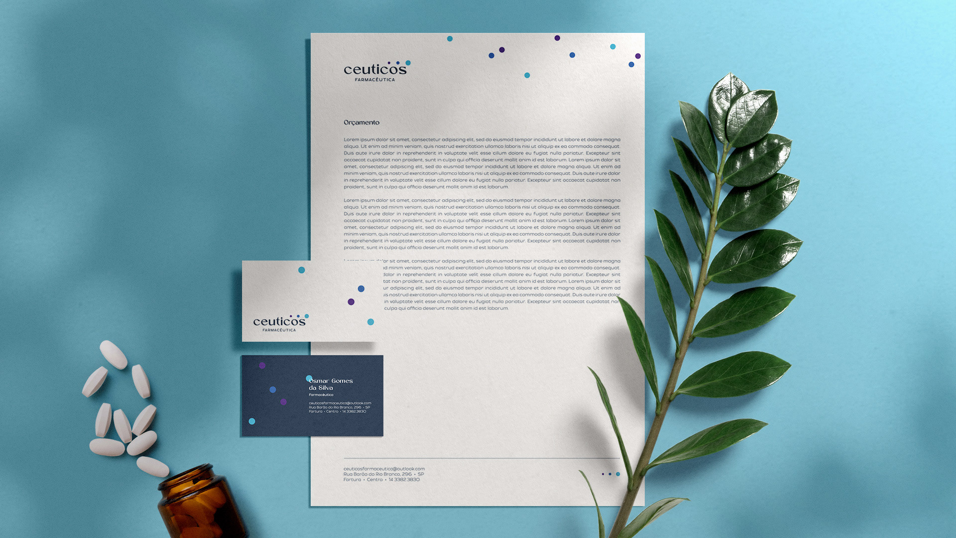
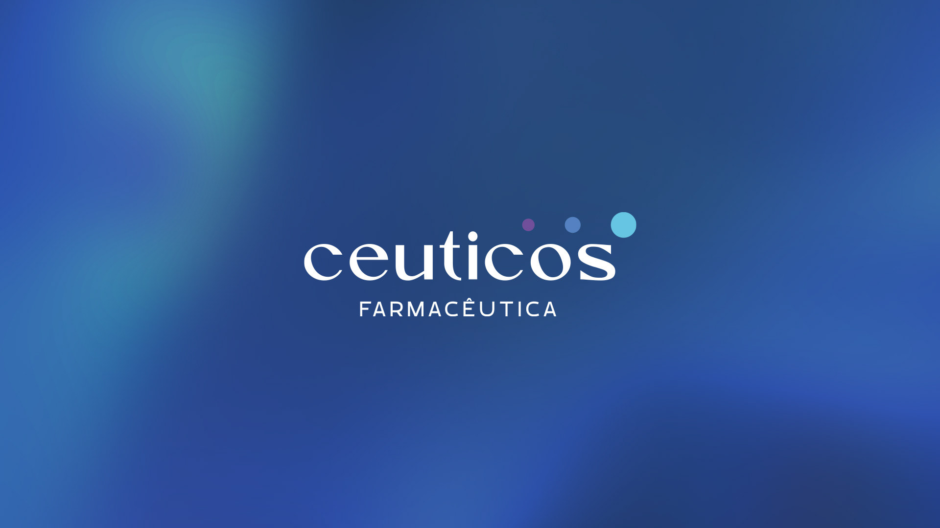
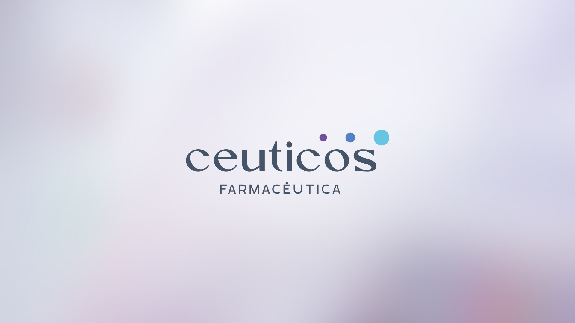
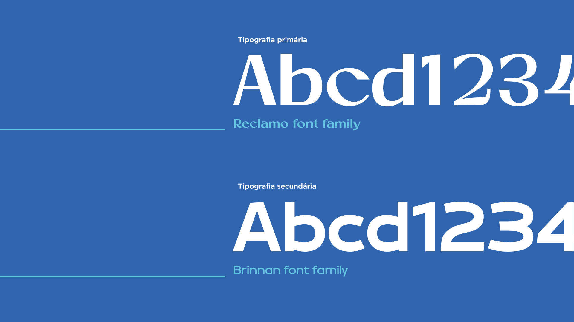
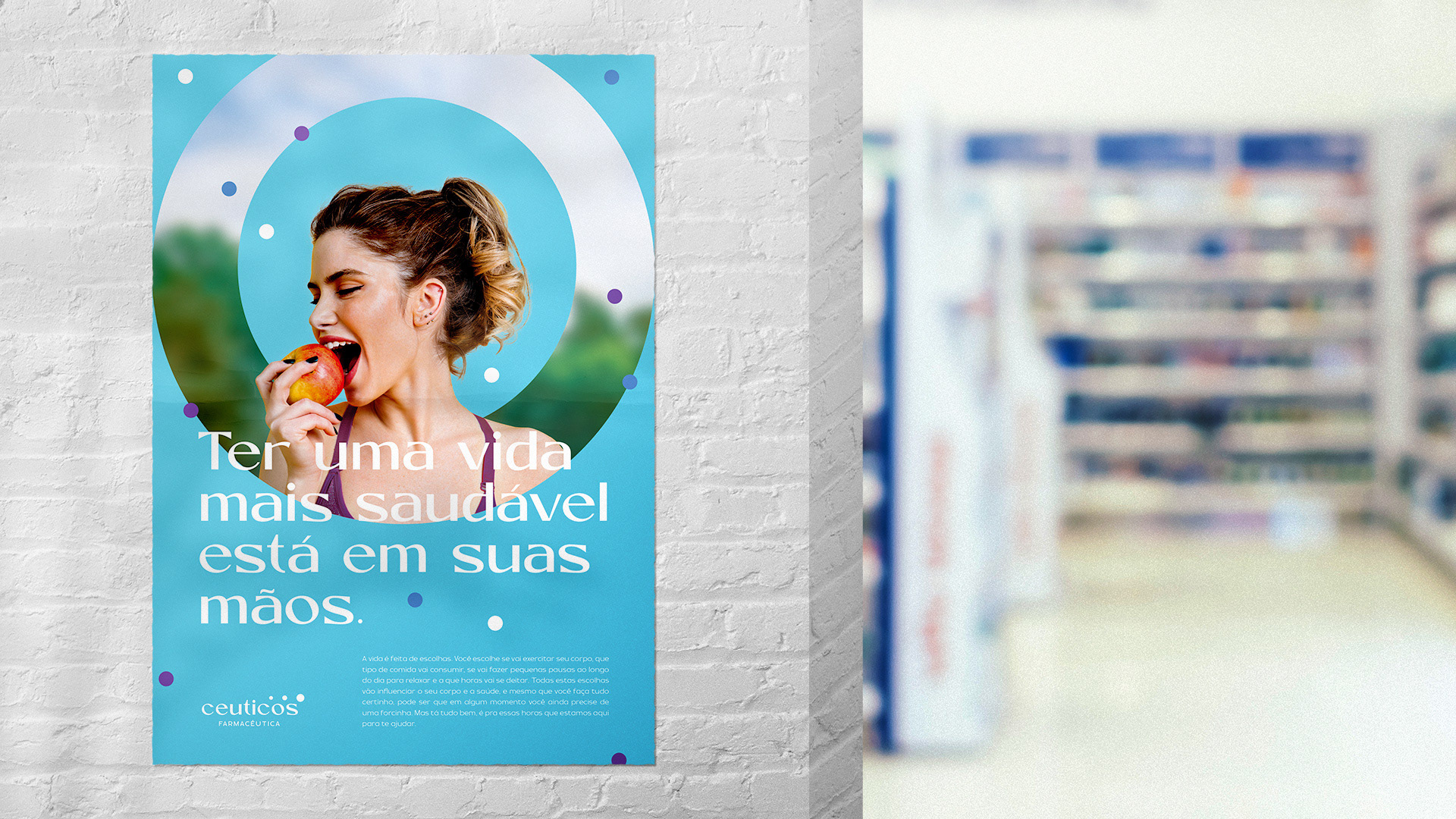
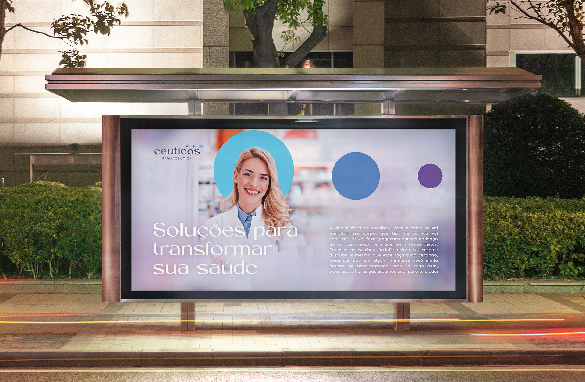
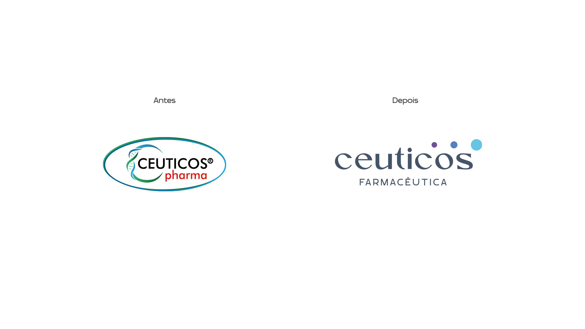
Representando o pilar da saúde, o símbolo traz círculos que remetem a glóbulos sanguíneos e células do organismo, eles aumentam de tamanho ao longo de sua trajetória, representando o pilar da transformação de um paciente em início de tratamento e ao final, aumentando seu bem-estar. A tipografia em caixa baixa traz a sensação de proximidade, de uma marca mais humana, moderna e que está sempre se atualizando.
---
Ceuticos is a pharmaceutical laboratory focused on dietary supplements that help the health and well-being of customers. Operating in several segments, and seeking to expand the local operation, the company needed a brand rebranding to convey a more modern and professional image.
To keep the company aligned and well positioned in the market, we defined the brand attributes in: health, human, transformation and trust.
Representing the pillar of health, the symbol brings circles that refer to blood cells and body cells, they increase in size along their trajectory, representing the pilar of transformation of a patient at the beginning of treatment and at the end, increasing their well-being. The lowercase typography brings the feeling of closeness, of a more human, modern brand that is always updated.